What does the Fed's dot plot actually show?
Four times a year the Fed publishes anonymous projections of where each member thinks rates are heading — the "dots". The market reads the median dot as the Fed's plan, though it's really a collection of individual guesses.
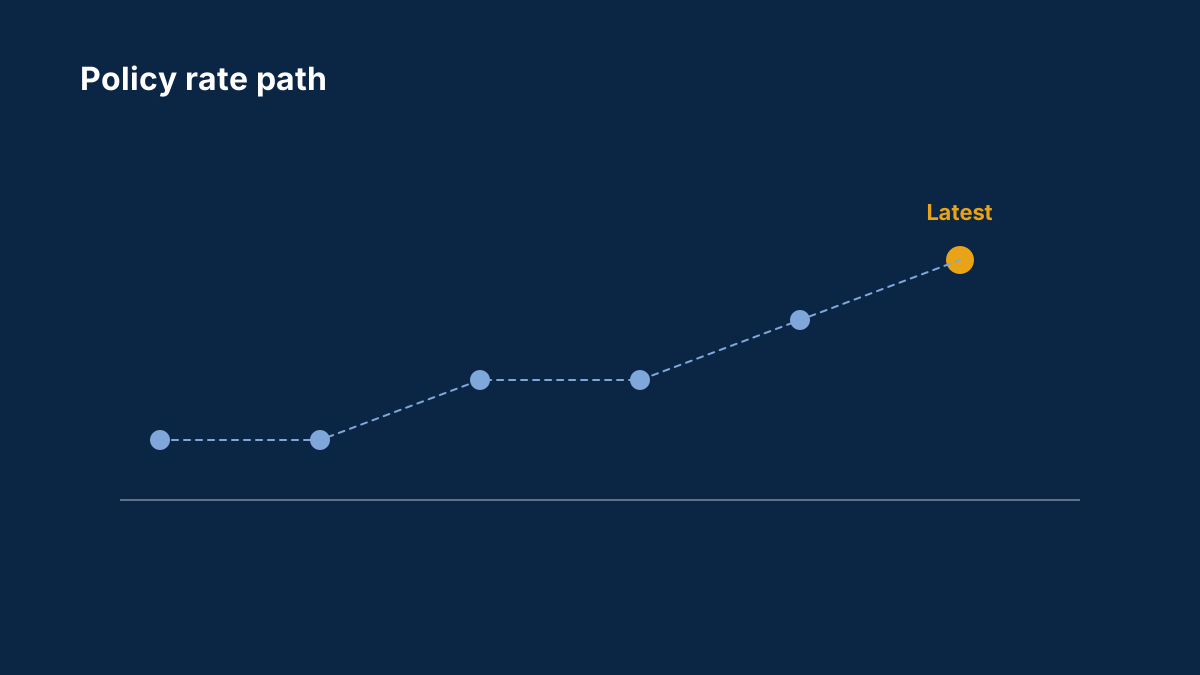
Beginners: what did you think the dots meant before you learned? Experienced members: how much weight do you give the median versus the spread of dots?
The dot plot guide decodes it.
Background: The Fed's dot plot and economic projections explained
Four times a year Fed officials publish where they think interest rates are heading. How to read the dot plot, and why it can move the dollar more than the decision.
How often does the Fed publish the dot plot?
Four times a year, with the Summary of Economic Projections at the March, June, September and December FOMC meetings.
Is the dot plot a forecast of Fed policy?
It shows each official's view of appropriate policy at the time, not a commitment. The median dot is widely watched, but projections change as economic conditions change.
Comments
Log in to join the discussion. Comments follow the community guidelines.
Log in to commentLoading comments…