The Fed's dot plot and economic projections explained
Four times a year Fed officials publish where they think interest rates are heading. How to read the dot plot, and why it can move the dollar more than the decision.
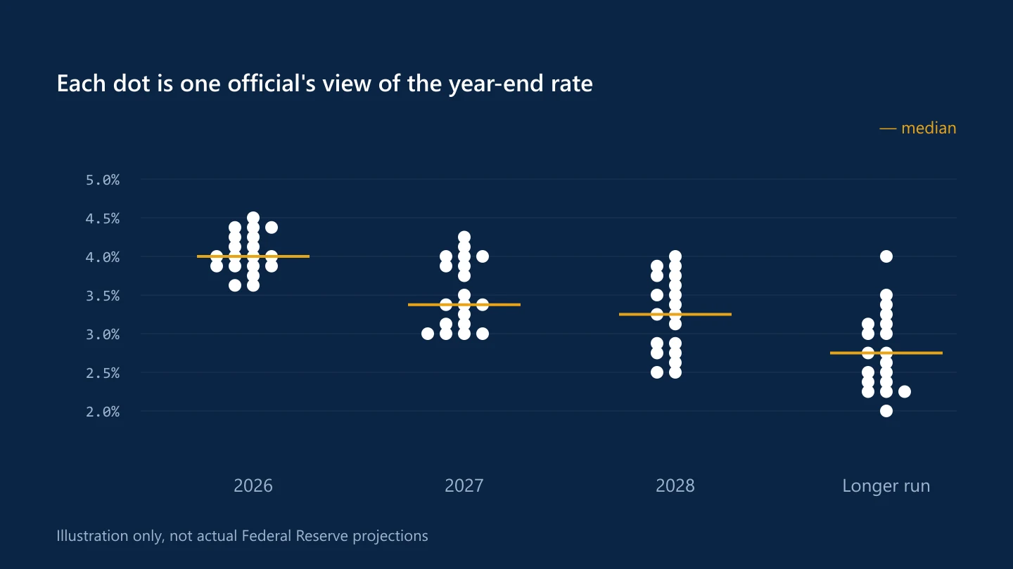
At four of its eight meetings each year, in March, June, September and December, the Federal Reserve publishes the Summary of Economic Projections, or SEP. Its best-known chart is the dot plot.
What the dot plot shows
Each dot is one Fed official's view of the appropriate level for the federal funds rate at the end of a given year: the current year, the next two or three years, and "the longer run". The dots are anonymous, so you can't tell who placed which one.
Participants include the members of the Board of Governors and the presidents of the regional Federal Reserve Banks, up to 19 people when all seats are filled. Only some of them vote on policy at any meeting, but all of them submit projections.
The median is the headline
Markets focus on the median dot for each year. If the median for the end of next year moves up by a quarter point compared with the previous projections, that is read as officials expecting a slightly higher path for rates.
The spread of the dots matters too. Dots bunched tightly suggest agreement; dots scattered widely suggest a committee that is divided or uncertain.
The rest of the projections
The SEP also includes each participant's projections for:
- Real GDP growth
- The unemployment rate
- PCE inflation
- Core PCE inflation
Changes in these explain the dots. A higher inflation forecast alongside higher dots tells a consistent story.
Why it moves markets
The rate decision is often fully expected. The dot plot is new information about the path ahead, so it can shift expectations for future meetings, and with them Treasury yields, the dollar and gold.
What it is not
The dot plot is not a promise. It records individual forecasts based on what officials know at the time, and it can change a great deal between projections as the economy changes. Fed chairs regularly stress that policy decisions are made meeting by meeting.
When it is published
The projections are released with the policy statement at 2:00 p.m. New York time on the second day of the meeting. For the September 2026 meeting, that is 16 September; see the Fed preview.
Sources
Common questions
How often does the Fed publish the dot plot?
Four times a year, with the Summary of Economic Projections at the March, June, September and December FOMC meetings.
Is the dot plot a forecast of Fed policy?
It shows each official's view of appropriate policy at the time, not a commitment. The median dot is widely watched, but projections change as economic conditions change.
This article is for information only and is not financial advice. Trading forex and CFDs carries a high risk of losing money. Read the risk warning. Spotted an error? Tell the editors.

Comments
Log in to join the discussion. Comments follow the community guidelines.
Log in to commentLoading comments…