How the Fed's dot plot moves the dollar
Four times a year, the Fed publishes anonymous rate projections — the dot plot — and the dollar reprices on the median. Here is what the dots actually show, how the market reads them, and where the surprises hide.
Four times a year, the Federal Reserve publishes a chart of anonymous dots — each one a committee member's projection of where rates will go — and the dollar reprices within minutes. The dot plot is the Fed's most market-moving publication after the decision itself, because it converts nineteen private opinions into a single public map of the policy path. Reading it well is a core dollar-trader skill.
This guide explains what the dots actually are, how the market reads them, and where the surprises hide. The construction is in the Fed dot plot explained; this guide is the market transmission.
What the dots actually are
Each dot is one Federal Open Market Committee participant's forecast of the federal funds rate at the end of each coming year and over the longer run — submitted anonymously, compiled into one chart. The dots are not a plan and not a promise: they are nineteen individual guesses, made at one moment, and every one of them will change as the data changes. The chart's power comes from what the collection reveals: the committee's centre of gravity and its range of disagreement.
The market's read focuses on the median dot — the middle projection, treated as the committee's de facto forecast. The median's moves between meetings are the plot's headline: a median that shifts higher is hawkish, lower is dovish, unchanged is neutral. The dot plot guide walks through the chart's anatomy in detail.
Why the plot moves the dollar
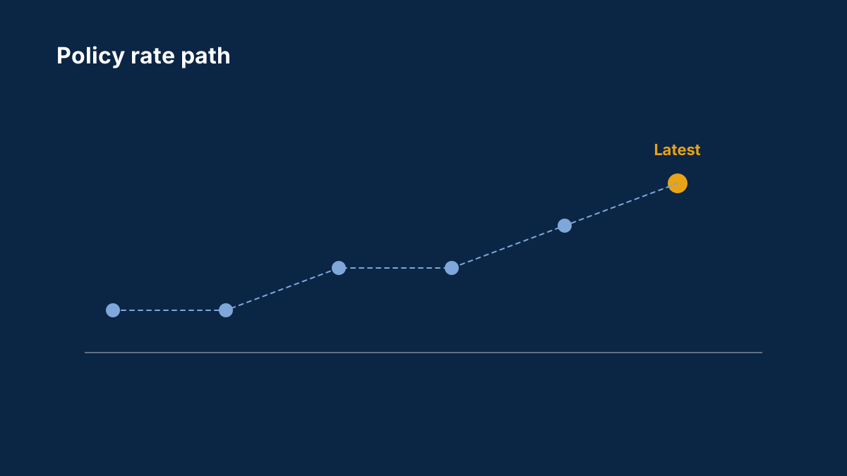
The dot plot moves the dollar because it is the Fed's most explicit communication about the future. The decision tells you what happened today; the dots tell you what the committee thinks happens next — and the dollar trades the future, not the present. A median dot that shifts higher raises the market's expected rate path, lifts US yields, and strengthens the dollar across the board; a lower median does the reverse. The transmission is the standard interest-rate chain, with the dots as the chain's forward-looking input.
The September 2026 plot is the live example: the Fed hiked and published projections showing rates staying near 4% through 2027 (report) — the median's persistence was the hawkish signal the market priced into the dollar's path.
Where the surprises hide
The median is the headline, but the surprises live in the details:
The shift in the median. A single quarter-point shift in the median year-end dot can move the dollar more than the decision itself, because it rewrites the expected path — and the path is what's priced.
The distribution's shape. The spread of the dots matters as much as the median. A committee clustered tightly around the median speaks with one voice; a wide scatter — dots split between hikes and cuts — means the median is fragile and the next data point can shift it. The scatter is the plot's uncertainty measure, and the market prices uncertainty itself.
The longer-run dot. The committee's estimate of the neutral rate — where policy neither stimulates nor restrains — is the plot's philosophical core. A rising longer-run dot tells the market the Fed believes rates will settle higher than previously thought, which reprices everything from the dollar to gold. The real yields explainer covers the gold side of that repricing.
The press conference's gloss. The chair's comments on the dots — emphasising the median, dismissing the scatter, or the reverse — steer the market's read. The same plot can be read hawkishly or dovishly depending on the gloss, which is why the dollar's biggest dot-plot moves often come during the press conference, not at the publication.
How the market trades the plot
The plot's trading pattern has a rhythm. The minutes around the publication produce the first, fast move — the median's shift, priced instantly. The press conference produces the second move, as the chair's gloss refines the read. The days after produce the third, as the market digests the distribution and the longer-run dot into the dollar's medium-term path. The central bank day playbook covers the event structure.
The pair-level effects follow the standard map: the dollar strengthens against the currencies whose central banks are expected to stay looser — most clearly the yen, given the Fed-BoJ gap — and moves least against the ones hiking in parallel. The Fed hike explainer has the pair-by-pair distribution.
The trader's checklist
The dot plot compresses into a checklist:
- The median's shift: higher, lower or unchanged against the previous plot — the headline signal.
- The scatter: tight or wide — the committee's conviction or its fragility.
- The longer-run dot: the neutral-rate signal, the plot's slowest and deepest message.
- The chair's gloss: which dots the press conference emphasises — the steering of the market's read.
- The pair map: which currencies' expected paths the new median widens the gap against — the dollar's distribution.
The dot plot is the Fed's most transparent piece of forward guidance — nineteen guesses, published and repriced in public. Read the median, the scatter and the longer run, and the dollar's four biggest scheduled repricings of the year become its most readable ones.
Sources
Common questions
What is the Fed dot plot?
A chart of each FOMC member's anonymous projection of the federal funds rate for the coming years and the longer run, published four times a year. It is the committee's most explicit forward guidance.
Why does the median dot matter more than the decision?
Because the median projects the path, and the dollar trades the path. A quarter-point shift in the median rewrites the expected rate trajectory, which reprices yields and the dollar.
What does a wide scatter of dots mean?
A divided committee — the median is fragile and the next data point can shift it. The market prices the uncertainty itself, and the dollar's reaction is less decisive than with a tight cluster.
What is the longer-run dot?
The committee's estimate of the neutral rate — where policy neither stimulates nor restrains. A rising longer-run dot says the Fed believes rates will settle higher, which reprices the dollar and gold.
When does the dot plot move the dollar most?
The first move comes at publication, the second during the chair's press conference gloss, and the third in the days after as the market digests the distribution and the longer-run dot.
This article is for information only and is not financial advice. Trading forex and CFDs carries a high risk of losing money. Read the risk warning. Spotted an error? Tell the editors.
Comments
Log in to join the discussion. Comments follow the community guidelines.
Log in to commentLoading comments…