How to read candlestick charts
Candlesticks pack four prices into one shape. How to read the body and wicks, what timeframes mean and why single patterns are weaker than they look.
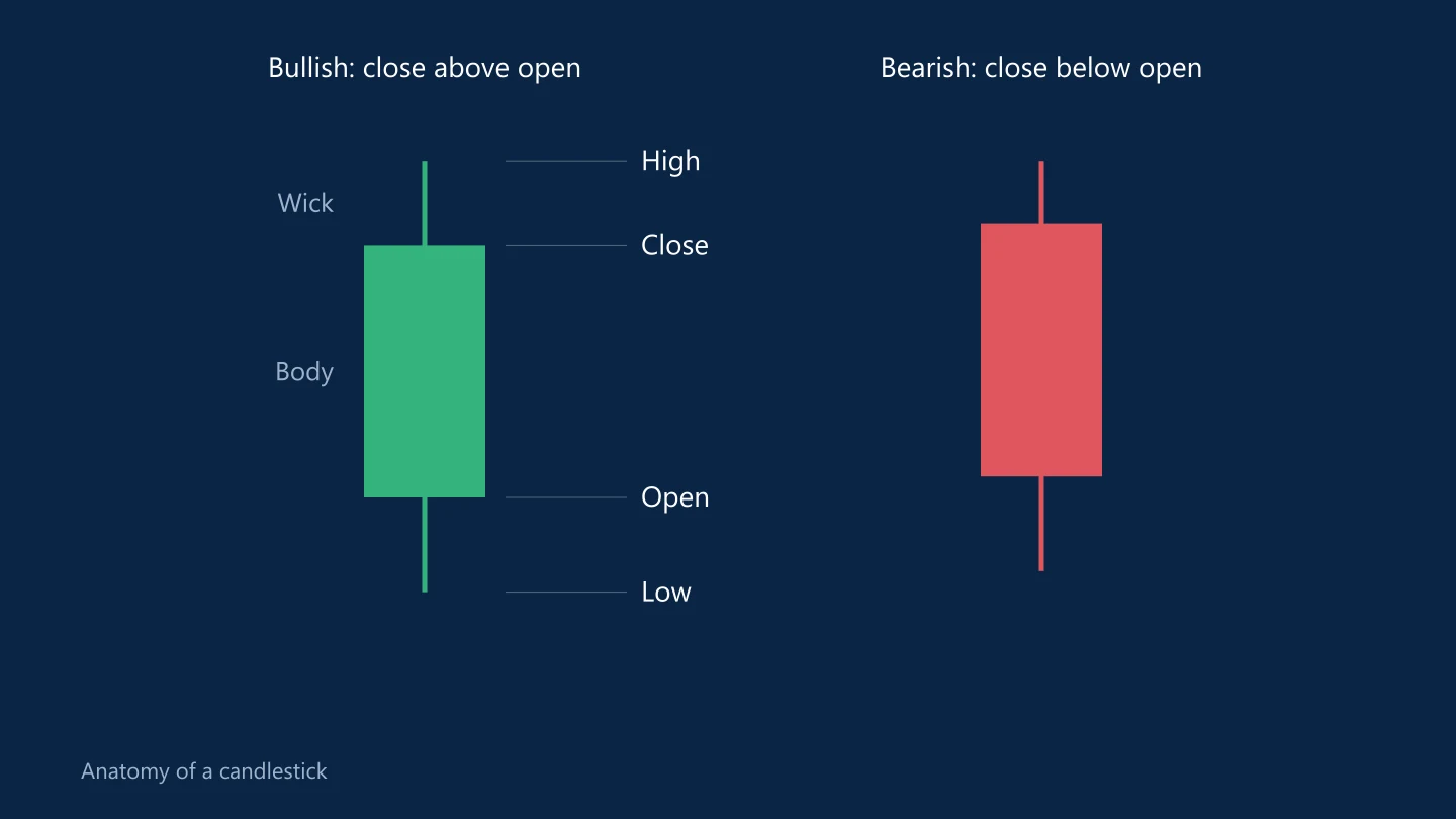
Candlestick charts are the default on almost every trading platform. Each candle shows how the price moved during one period, whether that is one minute, one hour or one day.
The four prices in a candle
- Open: the price at the start of the period
- High: the highest price reached
- Low: the lowest price reached
- Close: the price at the end of the period
Body and wicks
The body is the rectangle between the open and the close.
- If the close is above the open, the candle is bullish, usually shown in green or white.
- If the close is below the open, it is bearish, usually red or black.
The thin lines above and below the body are the wicks, also called shadows. The top of the upper wick is the high; the bottom of the lower wick is the low.
A long lower wick means sellers pushed the price down during the period but buyers brought it back up before the close. A long upper wick means the opposite.
Timeframes
The same market looks very different on different timeframes. A strong uptrend on the daily chart can contain several falling days, and an hourly chart can look choppy inside a clean weekly trend. Many traders decide direction on a higher timeframe and time entries on a lower one.
Most forex brokers draw daily candles from 5 p.m. New York time to 5 p.m. New York time, which gives five daily candles per week.
Patterns traders talk about
- Doji: open and close almost equal, showing indecision.
- Pin bar or hammer: a small body with one long wick, suggesting a rejected move.
- Engulfing: a candle whose body completely covers the previous candle's body in the opposite direction.
Patterns like these are popular because they are easy to see. On their own, they are unreliable. They mean more when they appear at a level that already matters, such as support or resistance, and on higher timeframes where each candle represents more trading.
Chart times and your broker
Candle times follow the broker's server clock, which may not match your own time zone. Two brokers can show slightly different candles for the same pair because their prices and server times differ.
Candles and news
A single data release can print a huge candle with long wicks on both sides as the price spikes one way and then the other. Those candles show volatility, not necessarily a new trend. The economic calendar explains most of them.
Common questions
What do the wicks on a candlestick mean?
The wicks show the highest and lowest prices reached during the period. A long wick shows that the price moved there but was pushed back before the candle closed.
Are candlestick patterns reliable?
Not on their own. They are more meaningful at important price levels and on higher timeframes, and they should be combined with a clear plan for risk.
This article is for information only and is not financial advice. Trading forex and CFDs carries a high risk of losing money. Read the risk warning. Spotted an error? Tell the editors.
Comments
Log in to join the discussion. Comments follow the community guidelines.
Log in to commentLoading comments…