Candles, bars or lines: which chart type do you use, and why?
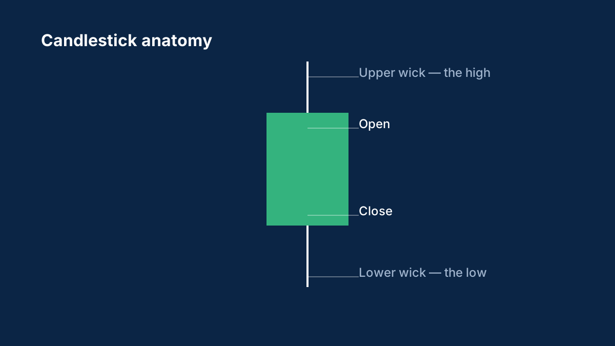
Candlesticks show the open-high-low-close story visually; bars show the same data more plainly; line charts show only closes. Most traders settle on candles, but the choice is worth being deliberate about.
Share:
- your chart type and why
- what you lose by not seeing the other data
- whether you've ever switched types and what changed
The candlestick guide starts with what each candle actually encodes.
Background: How to read candlestick charts
Candlesticks pack four prices into one shape. How to read the body and wicks, what timeframes mean and why single patterns are weaker than they look.
What do the wicks on a candlestick mean?
The wicks show the highest and lowest prices reached during the period. A long wick shows that the price moved there but was pushed back before the candle closed.
Are candlestick patterns reliable?
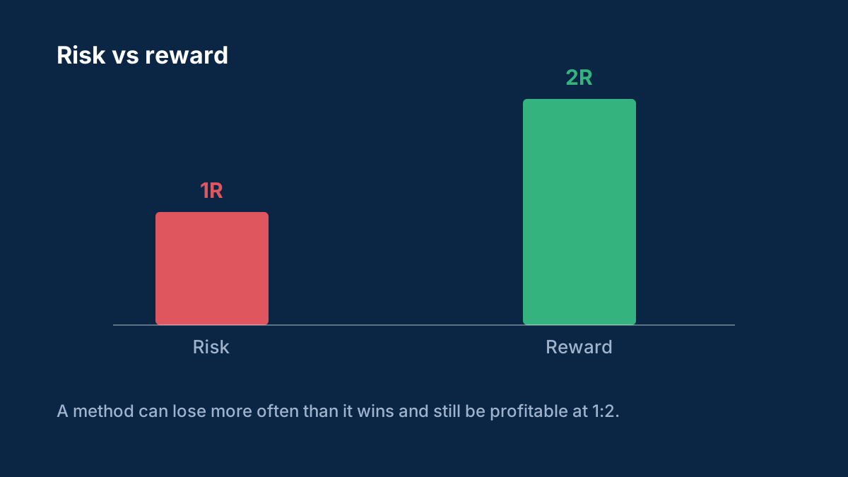
Not on their own. They are more meaningful at important price levels and on higher timeframes, and they should be combined with a clear plan for risk.
Comments
Log in to join the discussion. Comments follow the community guidelines.
Log in to commentLoading comments…